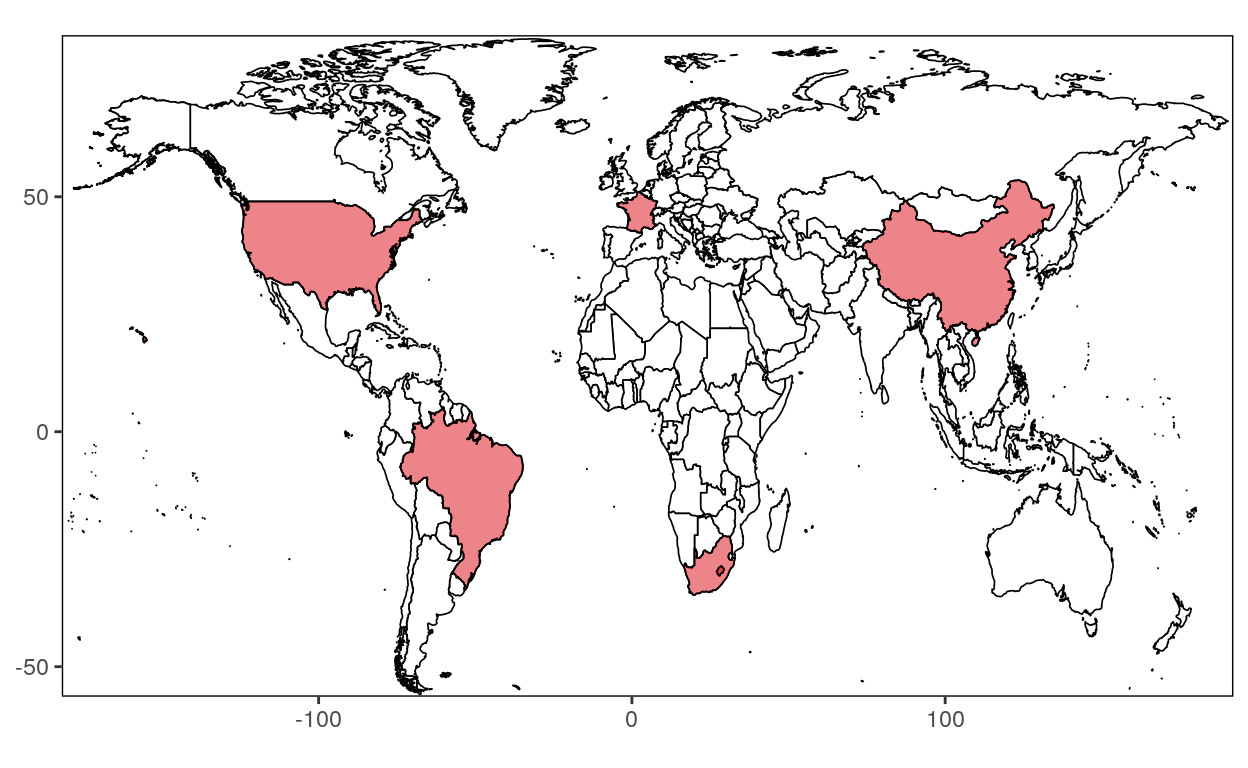
This course will teach you how to draw lines to divide a country into smaller regions.
Load the following package
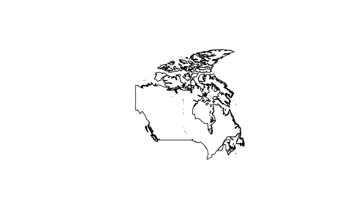
Retrieve data to create map of level 0 (Country)
Canada <- getData('GADM', country="CAN", level=0)
plot(Canada)
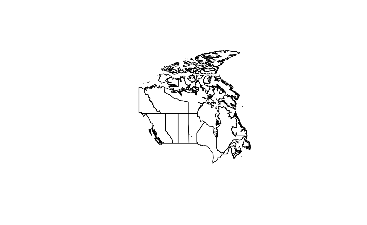
Retrieve data to create map of level 1 (Provinces)
Canada <- getData('GADM', country="CAN", level=1)
plot(Canada)
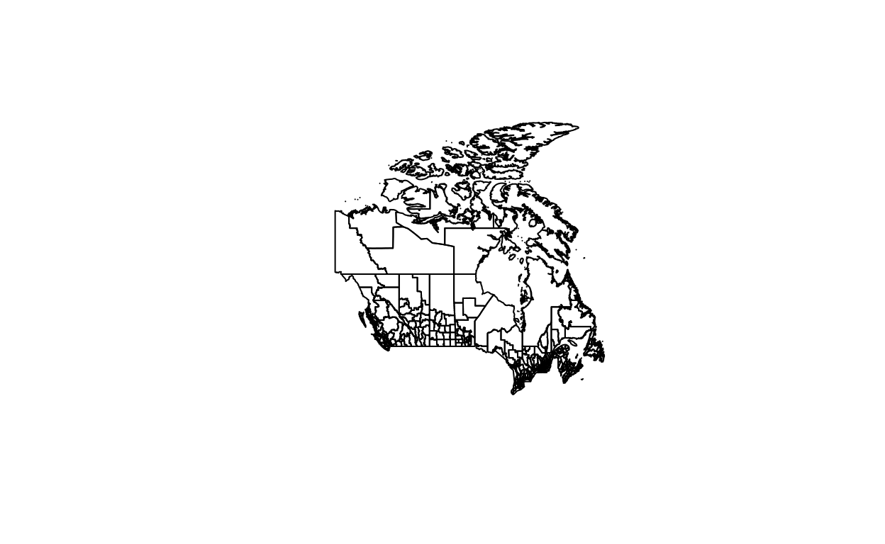
Retrieve data to create map of level 2 (Urban Division)
Canada <- getData('GADM', country="CAN", level=2)
plot(Canada)
Citation
For attribution, please cite this work as
Warin (2020, Jan. 28). Thierry Warin, PhD: [R Course] Data Visualization with R: Map Levels. Retrieved from https://warin.ca/posts/rcourse-datavisualizationwithr-mapslevels/
BibTeX citation
@misc{warin2020[r,
  author = {Warin, Thierry},
  title = {Thierry Warin, PhD: [R Course] Data Visualization with R: Map Levels},
  url = {https://warin.ca/posts/rcourse-datavisualizationwithr-mapslevels/},
  year = {2020}
}