This blog will teach you how to create a map with custom colors with ggplot2.
Step 1 : Load the package
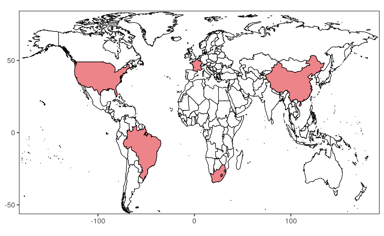
Step 2 : Retrieve the data
# Loading World data
world <- map_data("world")
# Remove the Antarctica region
world <- subset(world, region != "Antarctica")
# Remove the French Southern and Antarctic Lands region
world <- subset(world, region != "French Southern and Antarctic Lands")
# Select the countries you want to keep
countries <- subset(world, region %in% c("Canada", "USA", "France", "South Africa", "Brazil","China"))
# Assign a code to the countries
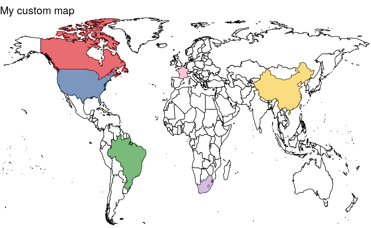
southAfrica <- subset(countries, region %in% c("South Africa"))
france <- subset(countries, region %in% c("France"))
brazil <- subset(countries, region %in% c("Brazil"))
canada <- subset(countries, region %in% c("Canada"))
usa <- subset(countries, region %in% c("USA"))
usa <- subset(usa, !(subregion %in% c("Alaska")))
china <- subset(countries, region %in% c("China"))
Step 3: Create your custom map
Step 3.1: Produce a blank World map
map <- ggplot(data = world, aes(x = long, y = lat, group = group)) +
  geom_polygon(fill = "white", color = "black", size = 0.3)

map
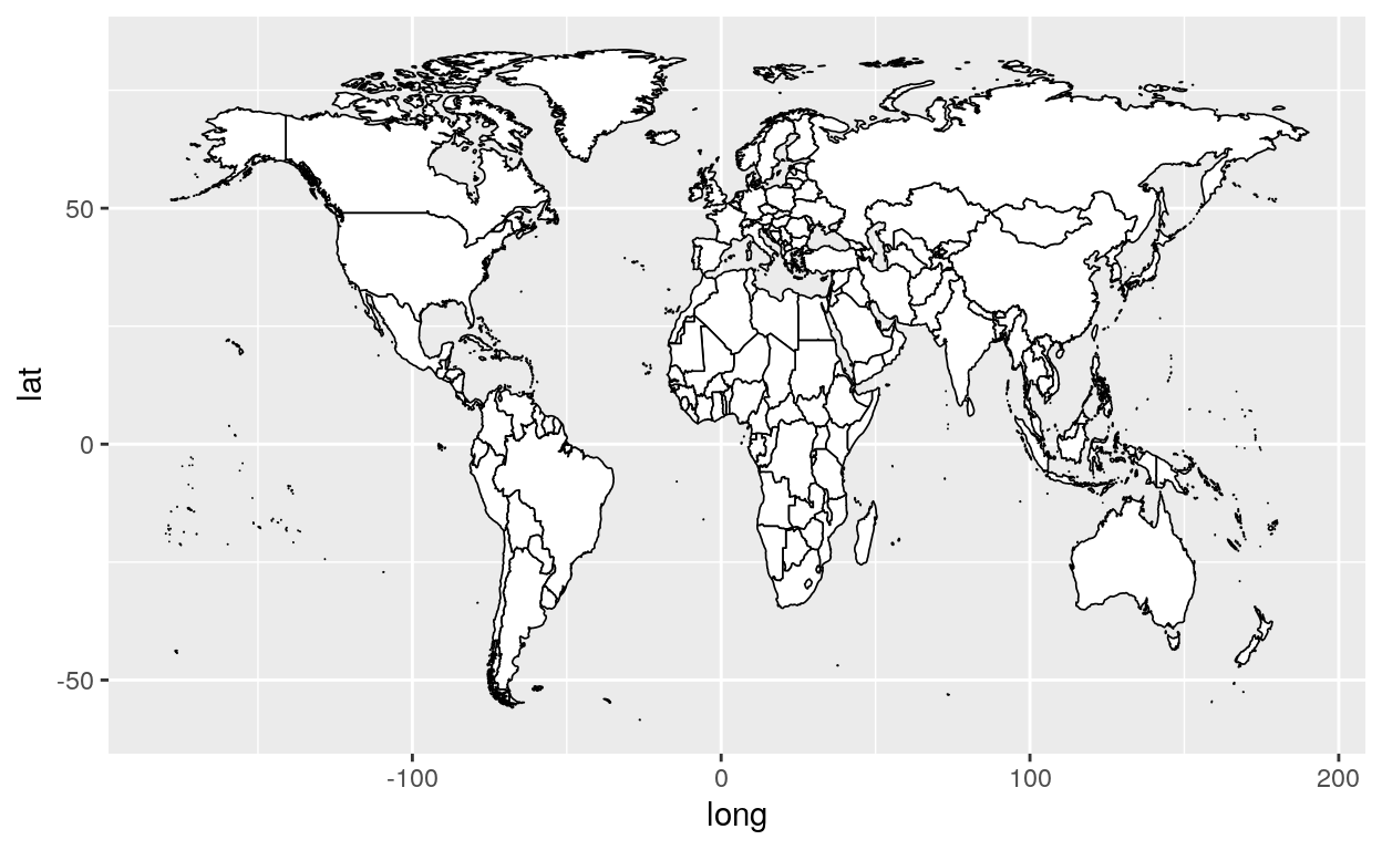
Your blank world map will now be called “map”
Step 3.2: Add your countries
finalmap <- map +
  geom_polygon(data = southAfrica, fill = "#b491c8", size = 0.3, alpha = 0.6) +
  geom_polygon(data = france, fill = "#fda4ba", size = 0.3, alpha = 0.6) +
  geom_polygon(data = brazil, fill = "#228c22", size = 0.3, alpha = 0.6) +
  geom_polygon(data = canada, fill = "#db0a16", size = 0.3, alpha = 0.6) +
  geom_polygon(data = usa, fill = "#255293", size = 0.3, alpha = 0.6) +
  geom_polygon(data = china, fill = "#f8c72d", size = 0.3, alpha = 0.6)

finalmap
Your final map will now be called “finalmap”
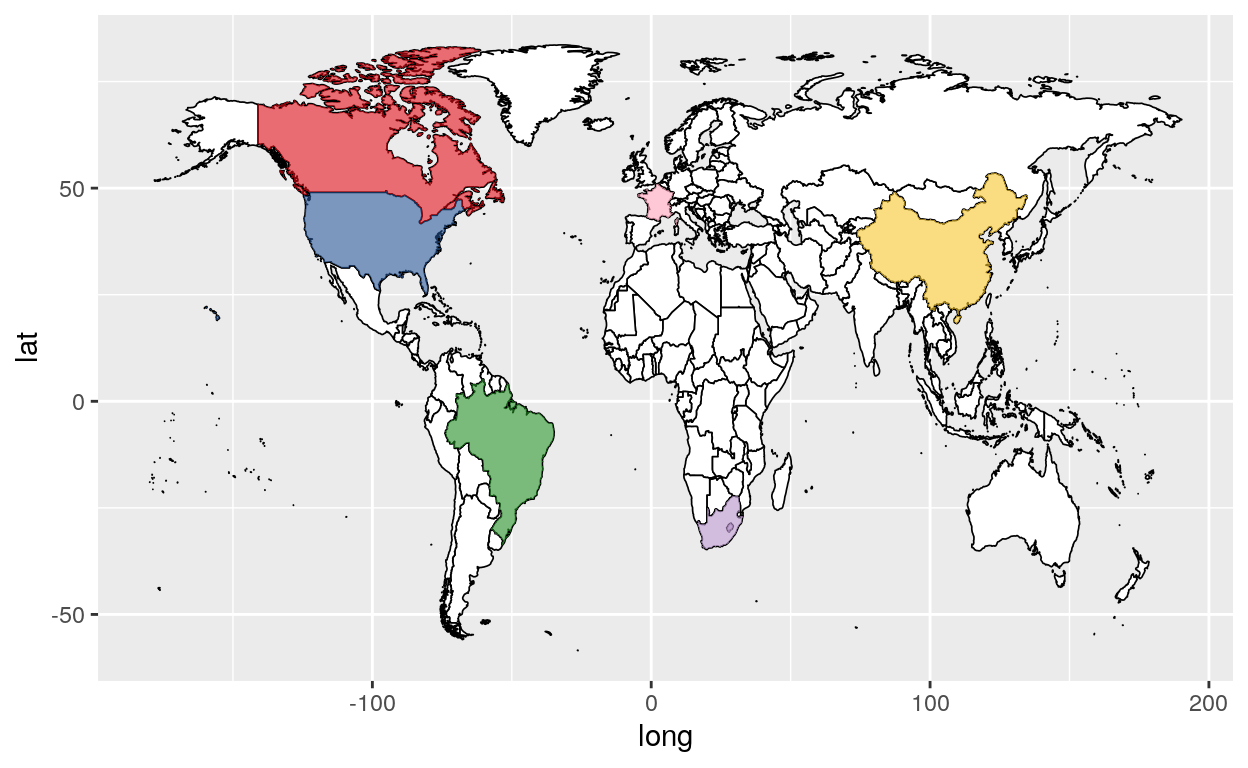
Step 3.3: Add finishing touches to your map
#Add a theme to your final map
finalmap +
  theme(legend.position = "none") +
  theme_void() +

# Add titles to your axis (optional)
  xlab("") +
  ylab("") +

# Add a title to your map
  ggtitle("My custom map") +

# Choose the size of your map
  coord_fixed(ratio=1.5, xlim = c(-165,175), ylim = c(-50,78))
Colors
Choose your own colors with the help of the link below !
You can add as many countries and as many colors as you want.
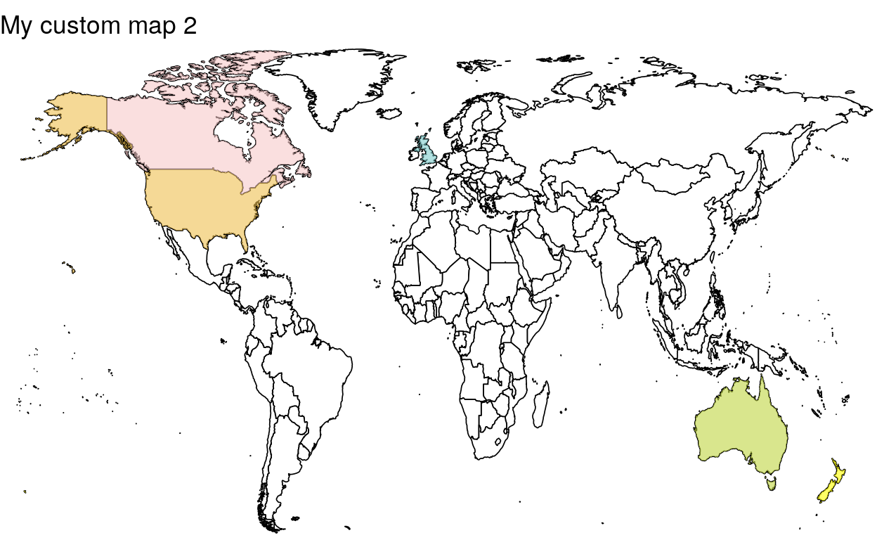
Here is another example of a custom map
library(ggplot2)
world <- map_data("world")
world <- subset(world, region != "Antarctica")
world <- subset(world, region != "French Southern and Antarctic Lands")

countries <- subset(world, region %in% c("Canada", "USA", "UK", "Australia","New Zealand"))

canada <- subset(countries, region %in% c("Canada"))
usa <- subset(countries, region %in% c("USA"))
uk <- subset(countries, region %in% c("UK"))
australia <- subset(countries, region %in% c("Australia"))
newzealand <- subset(countries, region %in% c("New Zealand"))

ggplot(data = world, aes(x = long, y = lat, group = group)) +
  geom_polygon(fill = "white", color = "black", size = 0.3) +

  geom_polygon(data = canada, fill = "#F7CAC9", size = 0.3, alpha = 0.6) +
  geom_polygon(data = usa, fill = "#EFC050", size = 0.3, alpha = 0.6) +
  geom_polygon(data = uk, fill = "#7FCDCD", size = 0.3, alpha = 0.6) +
  geom_polygon(data = australia, fill = "#BFD641", size = 0.3, alpha = 0.6) +
  geom_polygon(data = newzealand, fill = "#FFFF00", size = 0.3, alpha = 0.6) +

  theme(legend.position = "none") +
  theme_void() +

  xlab("") +
  ylab("") +

  ggtitle("My custom map 2") +

  coord_fixed(ratio=1.5, xlim = c(-170,175), ylim = c(-50,80))