This course will teach you how to draw lines to divide a country into smaller regions and add colors. This tutorial is an extension of the following course: Data Visualization with R: Map Levels.
Load packages
Retrieve and manipulate data
Canada1 <- getData('GADM', country="CAN", level=1)

Canada1@data$NAME_1
 [1] "Alberta"                   "British Columbia"
 [3] "Manitoba"                  "New Brunswick"
 [5] "Newfoundland and Labrador" "Northwest Territories"
 [7] "Nova Scotia"               "Nunavut"
 [9] "Ontario"                   "Prince Edward Island"
[11] "Québec"                    "Saskatchewan"
[13] "Yukon" Quebec<-Canada1[Canada1@data$NAME_1 == "Québec",]
Quebec_df<-fortify(Quebec)
NAME_1<-Canada1@data$NAME_1
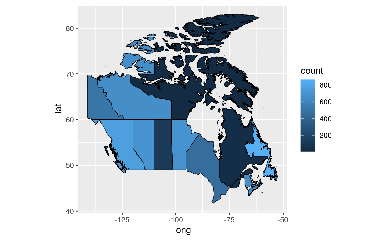
count<-sample(1:1000,13) #or any other data you can associate with admin level here
count_df<-data.frame(NAME_1, count)
Canada1@data$id <- rownames(Canada1@data)
Canada1@data <- join(Canada1@data, count_df, by="NAME_1")
Canada1_df <- fortify(Canada1)
Canada1_df <- join(Canada1_df,Canada1@data, by="id")
Create map
theme_opts<-list(theme(panel.grid.minor = element_blank(),
panel.grid.major = element_blank(),
panel.background = element_blank(),
plot.background = element_blank(),
axis.line = element_blank(),
axis.text.x = element_blank(),
axis.text.y = element_blank(),
axis.ticks = element_blank(),
axis.title.x = element_blank(),
axis.title.y = element_blank(),
plot.title = element_blank()))
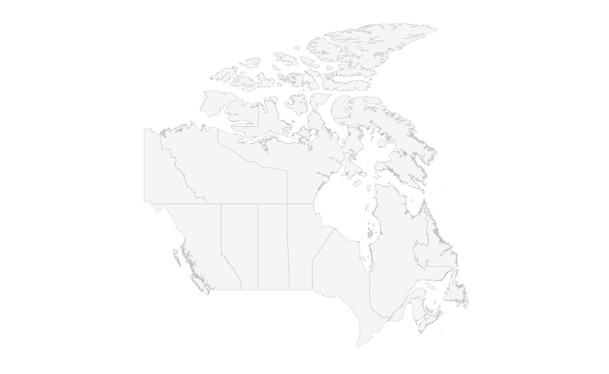
ggplot() +
geom_polygon(data=Canada1_df, aes(long,lat,group=group), fill="whitesmoke")+
geom_path(data=Canada1_df, aes(long,lat, group=group), color="grey", size=0.1) +
theme(aspect.ratio=1)+
theme_opts
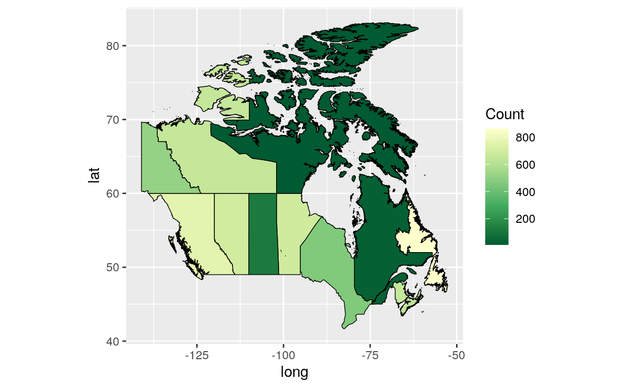
ggplot() +
  geom_polygon(data = Canada1_df, aes(x = long, y = lat, group = group, fill =
                                       count), color = "black", size = 0.25) +
  theme(aspect.ratio=1)
library(scales)
ggplot() +
  geom_polygon(data = Canada1_df, aes(x = long, y = lat, group = group, fill =
                                       count), color = "black", size = 0.25) +
  theme(aspect.ratio=1)+
  scale_fill_distiller(name="Count", palette = "YlGn", breaks = pretty_breaks(n = 5))