This course will teach you how to use the WDI package.
The World Development Indicators is a compilation of relevant, high-quality, and internationally comparable statistics about global development and the fight against poverty. The database contains 1,600 time series indicators for 217 economies and more than 40 country groups, with data for many indicators going back more than 50 years.
Extracting data
Data Wrangling
names(pollution)[names(pollution) == "EN.ATM.CO2E.KT"] <- "pollution_qty" #rename column
names(pollution)[names(pollution) == "country"] <- "ADMIN" #rename column

# gsub function to rename ADMIN regions in "pollution" data frame to match "world@data" ADMIN regions
pollution$ADMIN <- gsub("United States", "United States of America", pollution$ADMIN)
pollution$ADMIN <- gsub("Russian Federation", "Russia", pollution$ADMIN)
pollution$ADMIN <- gsub("Egypt, Arab Rep.", "Egypt", pollution$ADMIN)
pollution$ADMIN <- gsub("Iran, Islamic Rep.", "Iran", pollution$ADMIN)
pollution$ADMIN <- gsub("Venezuela, RB", "Venezuela", pollution$ADMIN)
pollution$ADMIN <- gsub("Congo, Rep.", "Republic of the Congo", pollution$ADMIN)
pollution$ADMIN <- gsub("Congo, Dem. Rep.", "Democratic Republic of the Congo", pollution$ADMIN)
pollution$ADMIN <- gsub("Yemen, Rep.", "Yemen", pollution$ADMIN)
pollution$ADMIN <- gsub("Tanzania", "United Republic of Tanzania", pollution$ADMIN)
pollution$ADMIN <- gsub("Syrian Arab Republic", "Syria", pollution$ADMIN)
pollution$ADMIN <- gsub("Korea, Dem. People’s Rep.", "North Korea", pollution$ADMIN)
pollution$ADMIN <- gsub("Korea, Rep.", "South Korea", pollution$ADMIN)
pollution$ADMIN <- gsub("Kyrgyz Republic", "Kyrgyzstan", pollution$ADMIN)
pollution$ADMIN <- gsub("Slovak Republic", "Slovakia", pollution$ADMIN)
pollution$ADMIN <- gsub("Czech Republic", "Czechia", pollution$ADMIN)
pollution$ADMIN <- gsub("Serbia", "Republic of Serbia", pollution$ADMIN)
pollution$ADMIN <- gsub("Timor-Leste", "East Timor", pollution$ADMIN)
pollution$ADMIN <- gsub("Bahamas, The", "The Bahamas", pollution$ADMIN)
Visualizing data
# Open your shp file with the readOGR function
world <- readOGR('world.shp')
OGR data source with driver: ESRI Shapefile
Source: "/home/marinel/portfolio/warin/_posts/api-wdi-application/world.shp", layer: "world"
with 241 features
It has 94 fields
Integer64 fields read as strings:  POP_EST NE_ID
# Use "Left join" function to combine your two data frames
world@data <- left_join(world@data, pollution, by = "ADMIN")
# Create labels
world@data$ADMIN <- as.character(world@data$ADMIN)
labels <- sprintf("<strong>%s</strong><br/>%g", world@data$ADMIN, world@data$pollution_qty) %>% lapply(htmltools::HTML)
# Determinate the intervalls that will be shown in the map legend
bins <- c(0, 100000, 200000, 300000, 400000, 500000, Inf)
# Choose a color scheme for your map
colors <- colorBin("BuPu", domain = world@data$pollution_qty, bins = bins)
# Plot the data using leaflet
leaflet(world) %>%
addProviderTiles(providers$CartoDB.Positron) %>%
addLegend(pal = colors, values = world@data$pollution_qty, opacity = 0.7, title = NULL, position = "bottomleft") %>%
addPolygons(fillColor = ~colors(world@data$pollution_qty),
weight = 2,
opacity = 1,
color = "white",
dashArray = 1,
fillOpacity = 0.8,
highlight = highlightOptions(weight = 2,
color = "black",
dashArray = 1,
fillOpacity = 0.7,
bringToFront = TRUE),
label = labels
)
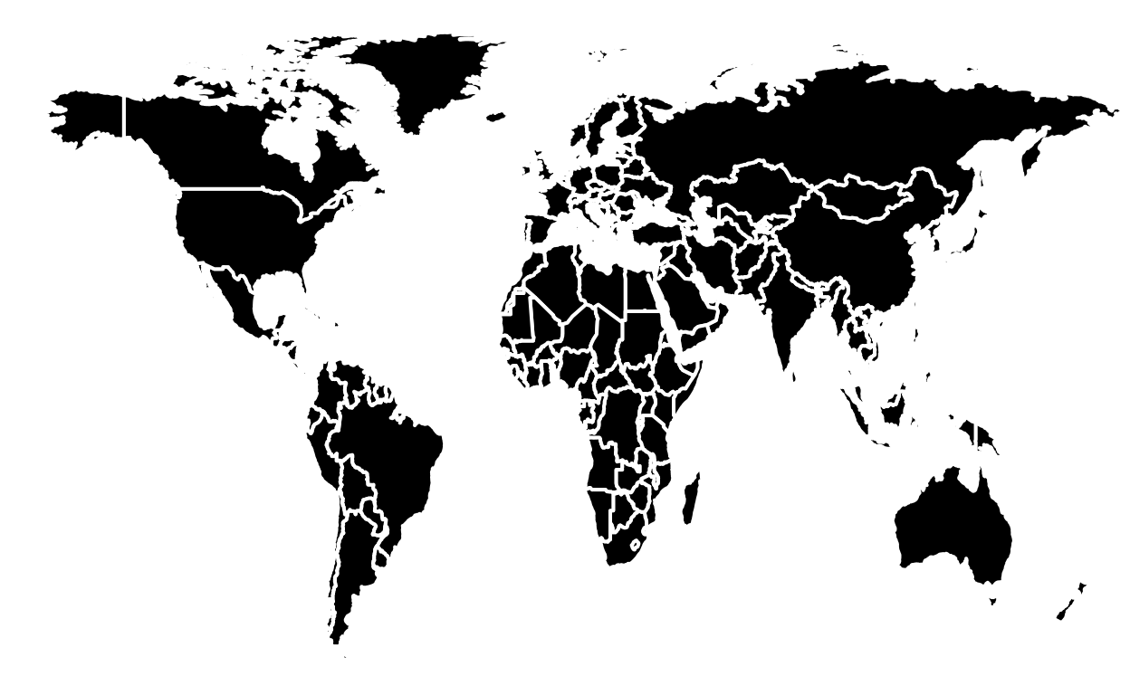
The map above illustrates the quantity of CO2 emissions in 2007 around the world. It’s easy to visualize that Canada, the United States, Russia, China, India, Iran, Germany, the UK, South Africa, Japan, Mexico and Italy are the countries that emited the most CO2 in 2007.